
At the helm of the Vibes Decor Team is Simran Seth, who often jokes about getting occupational lung disease from the amount of glitter floating around. We managed to catch her along with Rachana and Aarthi, the Sports Committee decor in-charges, in an interview punctuated by a dozen people asking them for instructions.
MTTN: Tell us a little bit about decor in Invictus, and what you envisioned for it.
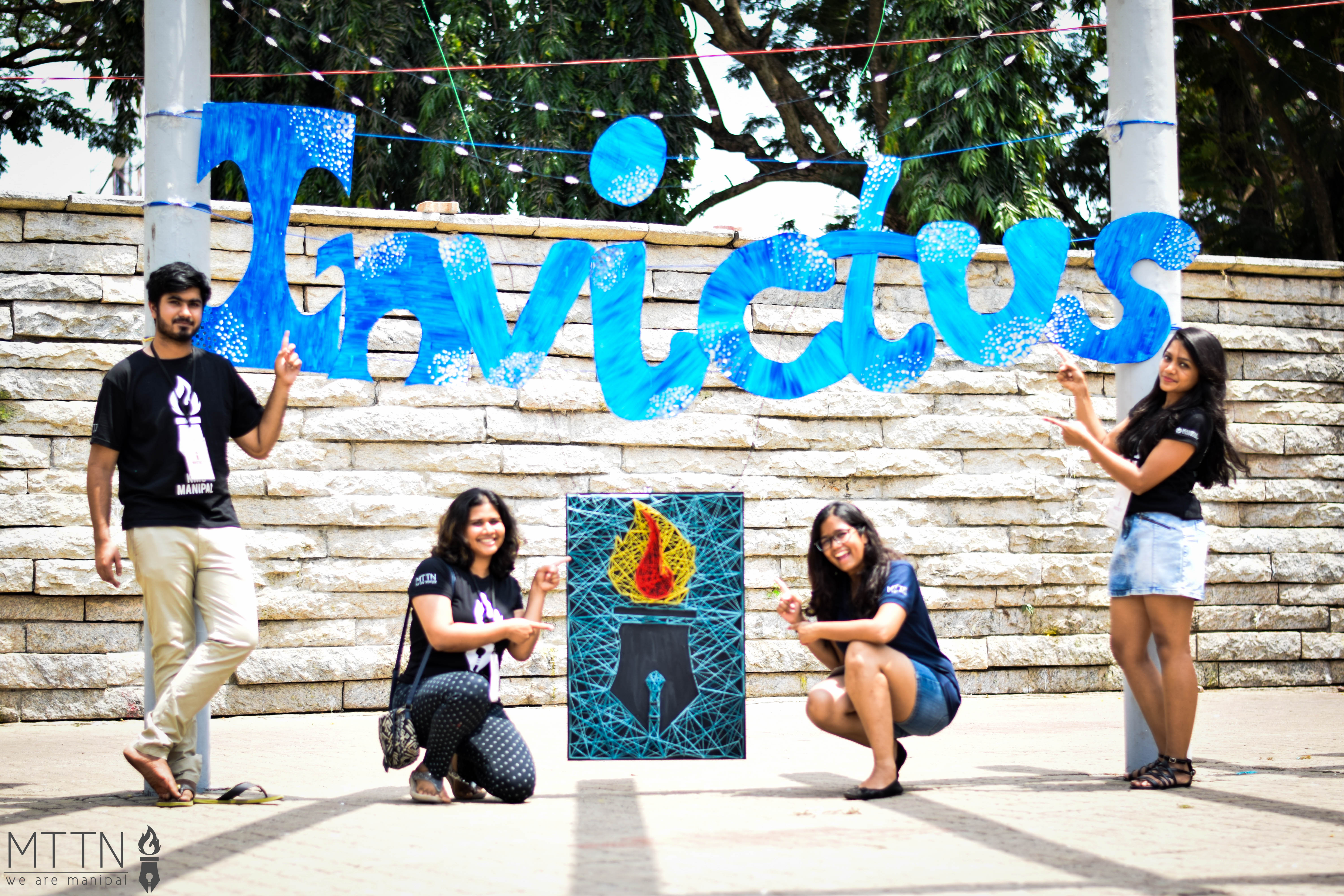
Rachana and Aarthi: For each of the sports venues, we’ve made a large centrepiece regarding that sport. We’re also handling decor in the latter half of the Greens, where we have an Invictus sign hung up, which is surrounded by lights.
Simran: As for Vibes, Pinterest is our best friend. I love working with lights, and I saw one picture of lamps in the centre of a larger set up, which was my inspiration for our centrepiece. We tried to make it simple but pretty, and came up with large lanterns, every side of which was a hexagon. I started off with an intricate geometric design, and prayed to God it would stand up! (laughs)
MTTN: What was the process like? How did you plan decor for this scale?
Rachana and Aarthi: Until this year, where the scale is much larger, decor was never a part of MIST! Last year, we just had one piece in the Greens. For the first time, the Sports Committee has had to do a lot of art. None of us are artists, so we’re all reliving our school days of art and craft.
Simran: The three days I went home to Bangalore were basically dedicated to Invictus. We bought foam boards and lanterns, and lights in bulk for cheap. We stuffed the foam board into my car, and got it sent by bus to Manipal. The wicker balls in TMA Pai were shipped from Bombay. As for the rest, I just carried a very big suitcase. To manage the scale, we tried to focus on assembly, rather than making everything from scratch.
MTTN: What have the biggest challenges been so far?
Simran: The wind! The wind at Greens is not our friend. The forecast says it won’t rain, and from experience, it only rains from mid-May, but our fingers are crossed.
It’s also a lot pressure. If this turns out well, our next time will have to be a lot bigger. But I really enjoy the work, and that’s why I do it.
Aarthi: Our venues are a lot more varied than those of Vibes. We have things to put up at End Point, right in the middle of the field, and there the wind is crazy. We’re even covering the Sharada and Nehru courts, aside from the Greens. It’s also harder to get the supplies we want from Manipal. And it never stops at just making the piece. You have to place it, fix it, and check the surroundings.
MTTN: So what was the best part of it all?
Rachana and Aarthi: At the end of the day, we had a lot of fun. Playing music, hanging out. It was very tiring, as we’d work in between classes and practice. We discovered a lot, though. We stuck our hands to each other with superglue, and burnt a whole lot of thermocol. Everyone was also really fascinated with the soldering iron. (laughs)
That’s not to make light of everyone else’s work, though. The committees have been at SAC till 2:30 every night, putting everything together. When asked about the strangest thing they’ve had to do, FAC admitted to taping their feet entirely so that ants in the Greens wouldn’t bite them. They also reported hanging off towers trying to tie lanterns, and spending an inordinate amount of time looking for tape, only to discover that the dogs had stolen it.
We then spoke to Meghna and Armaan, who headed design. Here’s what they had to say:
MTTN: What did you have in mind at the outset?
Meghna: We wanted something really different, and I think the most difficult part about it was finding a logo to unify two very different spheres: sports and cultural. Everything was rushed, considering which I think we did a really good job. We’d have meetings where we were told the brochure would be needed in a week. At that time, we hadn’t a name, we hadn’t come with a logo, and we didn’t know anything.
MTTN: What about the colour scheme? We hear that was quite the challenge.
Armaan: What we decided on was actually based on sunset at a beach. The orange was supposed to resemble the sun, the beige was to look like the sand, and the blue was of course, the water. We also came up with the background mandala designs from scratch.
Meghna: We wanted something that stood out, but was minimalistic and classy; no elements that are in your face. It was a challenge to come up with a layout and scheme that satisfied both committees. The Sports Committee is very energetic, and they preferred bolder designs. Cultural could have been more laid back and subtle, which is more my personal preference. Doing something that wasn’t my preference would have been difficult, even if it was a great design.
-As said to Dharini Prasad
Photographs by Shriya Dhaundiyal
Leave a Reply
You must be logged in to post a comment.